Splitz: Mobile Interaction Design
Role: UX Researcher & Product Designer
Location: Pratt Institute
Dates: Sept 2022 - Dec 2022
Timeline: 3 months
Collaborators: Hayley Greason
Scroll for More ↓

Our Goals
We aimed to understand how privacy and productivity is dealt with within these apps. The apps we focuses on to address the issues of are Venmo, Splitwise, and Zelle Our goal was to address the issue of mobile payments systems to make it easier for a user to split bills and make payments with friends.
Using the UX Design Process, design a mobile application that addresses a need and/or opportunity within the mobile tech industry.
Discover
Secondary Research
Analyzing topics of conversation in tech, we aim to understand productivity with mobile payments
Survey & Interviews
Gaining insight as to what users need is important so we ask a series of questions to multiple participants.
Competitive Reviews
Comparing current competitors to understand what is done well, what can be improved and what is missing.
Secondary Research
The industry of mobile payment systems has existed for a short time. Changes continue to arise quickly through trends of how we use mobile payment systems.These systems include mobile wallets, banking apps, and payment transfers.
Our research focuses on the pain points and current solutions of mobile payments. Families, friends, a group of co-workers, or any other groups sometimes struggle to split bills. Having a close relationship with this issue, our team focuses on potential opportunities.
So, what do people want from their mobile payment apps?

Surveys & Interviews
To understand what users need, we released surveys and conduct interviews. 41 interviews were completed. We split our questions in 2 sections
-
Getting to Know You
-
Research Questions
Analyzing what we found, we can determine what we wanted to investigate further and create questions to ask during the interview process.

This is how our participants responded.
From 4 interviews,
my team and I learned how people felt about specific topics of mobile payment apps. the topics are Security/Privacy, Contact Search, Trust, and Fairness when it comes to mobile payments apps. The quotes from the interviewees reflect the topic area that was identified.
01
Privacy & Security
Interviewees don’t know much about how their information is protected or stored. Still ranged from comfortable to not very comfortable with sharing bank account info.
02
Finding Contacts
Interviewees have either paid the wrong person or are worried about paying the wrong person when sending money.
03
Trust
How much do you trust acquaintances to pay you back? Who is in control of requesting payments? Interviewees grappled with these questions.
04
Splitting & Fairnesss
Interviewees said splitting the bill only works if everyone ordered the same amount (alcohol/drinks can get pricey if one person indulges).
Competitive Review
To get to know what we are missing, we analyze the current competitors on the market.
Insights on Competitors
1
QR code is a common form for a unique identifier instead of phone number or email.
3
Social aspect of apps (friends, groups) allow money to be sent accurately.
2
Apps can be directly connected to bank account and/or exist on banking apps.
4
Security is outlined and transparent to Users.
Define
Personas
Insights
Crazy 8 Ideation
Personas
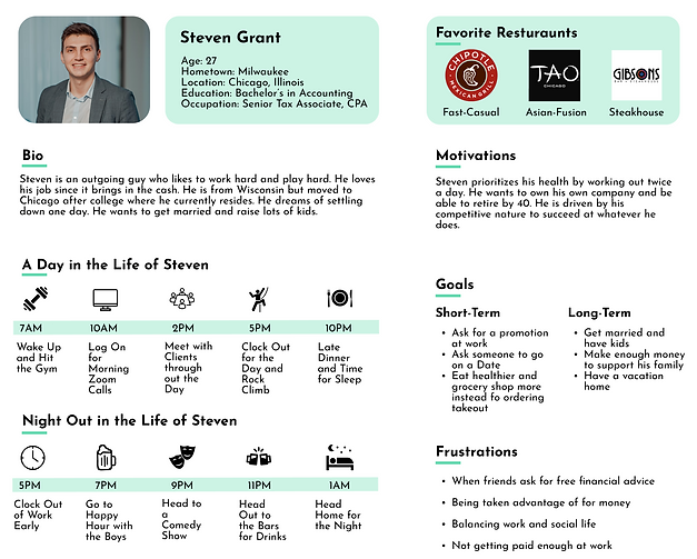
After gathering information on our participants, we created two personas. These personas helped guide our designs by knowing who are users are.


Insights
From our research we summarized our findings and grouped them into 4 categories. We highlight the repeated topics to have focuses during the design process.
Repeated Insights
Privacy & Security
Unique Identifiers
Bank Compatability
User-to-User Trust
Crazy 8 Ideation
As a rapid brainstorming idea, we folded a paper into 8 parts and gave ourselves 8 minutes to come up with ideas. To guide our brainstorm we came up with 3 questions.
How can we improve user perceptions of payment security between users?


How can we simplify
cost-splitting?
How can we make users more comfortable sending money to new users?

Design
Low-Fidelity Wireframes
User Testing
Mid-Fidelity Wireframes
Ideation
Low-Fidelity Wireframes
Gallery of Wireframes
We can simplify
cost-splitting by being more social/engaging.

How can we simplify cost-splitting?

We can make users more comfortable sending money to new users by being more secure.

User Testing
Flow 1
-
Fraction Icon is confusing when splitting by line item on the receipt
-
Adding Tips isn’t clear
-
Users like the ease of cost splitting, the group feature, and the layout

Flow 2
-
Mixed feelings on the Map, some liked the visual some felt it was invasive
-
“social mode” was preferred to “public mode”, although some didn’t want the option
-
List felt busy and boring, more users seemed to like the map view and liked being able to toggle

Flow 3
-
Verification was cumbersome to users - assumed it was mandatory
-
Users appreciated confirmation after sending. Want more of that in other flows
-
QR code and 2-step authentication viewed as easy and proficient

Mid Fidelity Wireframe
Ideation
Improvement 1: Make sure main action button stands out as button
“Oh that’s a BUTTON? Ok, I didn’t realize ‘Split the Bill’ was a button.” -User 2

Improvement 2: Add Privacy Option to Specific Transactions in Social Mode
“I guess I prefer private mode, since I don’t really care if people see what I do and there are some transactions that I want to keep private.”
-User 3

Improvement 3: Make “Split the Bill” only direct payment to owed company (not between users)
"This is basically Venmo with a few upgrades. The star feature is scanning the receipt and sending money directly to the restaurant. I like the idea of skipping all the extra payments, requests and owing.”
-User 1

Deliver
Visual Design
High Fidelity Prototype
Visual Design
Mood Board

Style Guide

High Fidelity Prototype
The prototype went through a long process of ideation and design to result in this. Explore and watch the prototype to see how the app works!
Login & Split Evenly

Private v. Social Mode
Requesting Payment

QR Code

Paying Someone for the
First Time
Search


Challenges
Creating a Home Screen
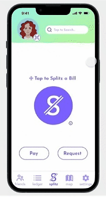
To highlight our main feature of splitting a bill, the Split Button needed to be highlighted and explained for users


Separating Social & Private Mode
Users were split between keeping data private and social. To cater to both sides, we created a design that flips between the two with ease. It is clear when you are in each mode.
Conclusion
From the Ideation to the Design process, there was a lot of rework and editing that needed to happen throughout the process. Our team made sure to keep in mind what users were asking for. This design is to help them rather than create something we think they need.


