Gooi Design System
Role: UX Designer
Brand: Sloomoo Institute
Date: March 2023 - May 2023
Timeline: 3 months
Collaborators: Hannah Ramirez, Yang Chen, Ruhee Shah
Read More ↓
A design system creates an ecosystem of components and patterns to create unified styles that can communicate with various design teams.


Team Goals
Using Sloomoo Institute's website, our design team came together to create a design system. The Sloomoo website lacked uniformity throughout different pages causing confusion with interactions on each page.
Breaking the website down, we can create a foundation that uses common user interface language. We then rebuild the components to create a library of UI components. From that point, we can document how and why we use specific components. The UI kit is created for designers while the document is geared towards developers.
We strived to reach a cohesive design system that can me used as an open-source tool for other designer creating a website.
Challenges
Problem


The Sloomoo Institute did not have a design system in place for its website. Each page contains different components that prevent the website from having a consistent design throughout the system. Some of the issues we found were:
-
Same components (like buttons, blocks, and carousels) formatted in different ways
-
No directions or guidelines on design
-
Inconsistent layouts across microsite like shopping pages and buying ticket pages
-
Inaccessible design with color and text
Challenges
Before setting our goals, we realized some challenges needed to be considered and solved.
1
ACCESSIBILITY
To address the issues we found with accessibility, we needed to use the Web Content Accessibility Standards (WCAG) to guide our decision making when it came to design.
2
COHESIVENESS
Because the Sloomoo Institute is located in multiple locations, it is important we focused on the staying consistent with the brand that was already set in place by the physical spaces.
3
READABILITY
All the information on the website is important. We had to make sure that the content can be found and the content can be read.
Building the System
UI Inventory

By doing an audit of the website, we understood what pieces made up the system. All of these components could then be compared. What we looked for was whether components were matched each other. Our next step was to figure out how to make these parts fit together.
Foundations
Our team aligned ourselves to create a library of components that maintains the brand and creates a more cohesive system. Gooi can be used for any brand. This system was designed fro the Sloomoo Institute Website and can be applied as a system for their brand, but Gooi is designed to be interchangeable and adaptable to other brands.
The system serves as a guideline for other designers. Because of that we made sure to make a system that guides the designer by using clear language that makes the system easy to use. It contains assets and local style that can be publicly accessed.

Typography
The typography used is Quicksand. The type is the same one used throughout the system, just on different size and weight. It can be used for headings, paragraphs, links and buttons which are all the types of text used in the system.

Color
The colors that are used in the system are separated between core, gradient, gray scale, feedback, & status colors. The core colors are given different shades to use when elements are active or disabled.

Spacing
Spacing is important to keep consistency between blocks and elements in layouts. We broke down what spacing can be used and included visualizations of it. The spacing bars are used as section dividers. The bars would be transparent to not be shown at each place it is used.


Icons
Icons are considered a foundation because they are a small elements that can be incorporated into different components. Some examples are buttons, input forms, and cards.

Component Library
Apart from the foundation elements in the system, there are more components that are used that can be copied to build upon the system. They follow the foundations that were created to maintain a cohesive design. We divided the components into groups.
This organization gives designers the opportunity to find components they are searching for with ease. We use common UI language to align with the UX industry. Some of the components are described below.


Buttons
Buttons are made to be small and large. Each button has a default and selected state. The variety of color and size give room to use in different places.
Cards
Cards are made up of images, text, and buttons. Different cards exist for different instances. Each card contains a default and hover state.


Input Forms
Input buttons are dependent on user input. The component reacts to whatever a user selects. The selectors will have default states and either hover and/or selected states.
Accessibility
When designing, it was important we followed WCAG Guidelines that lays out their principles. By taking into consideration accessibility guidelines, we can apply their principles to our design system before beginning the design process. When designing, it is important to consider accessibility first.
Gooi considers the multitude of human experiences and encourage others in the design community to put accessibility first when designing.
Colors
WCAG 2.1 requires the contrast ratio of large-text (14 point) to be at least 3:1 and for normal text ratio needs to be at least 4.5:1. Large text is 14 point (approximately 18.66 px) and bolded or 18 point (approximately 24 px) and larger.
Our team decided on keeping the brand colors that make up the Sloomoo Institute. Although some combinations are not accessible, we are aware of the combinations we are using. Specific color combinations are not made accessible such as white text on a yellow background.


Navigable
For UI components, a name and role needs to be determined programmatically according to the WCAG 4.1.2 guidelines for compatibility. Components include things like form elements and links. The name and purpose needs to be set by using states, properties, and values.
Our componentes are labeled with purpose. Each element is named based on industry UI naming conventions. If an element has different states, they are labeled and shown. For example, buttons include a default and hover state. The variants are labeled based on size, type, state, and color. The labels can be alternated which in turn will show an alternate form of the component.
Documentation
Bringing a design system to life includes documenting what was was created. This is where the design is put into words creating a central place. Our team created a documentation of our design principles, accessibility standards, components and best practices for designing. View the design documentation here.

An introduction gets the user started with why and how to use Gooi.
.png)
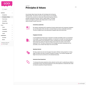
Our UX team states the Gooi principles and values to get the user to understand what is important to us.

Listing out our accessibility guidelines gives users tools to be more accessible when designing.

The states for components is included to understand how to use them. Do's and Don'ts assist with the governance.

Showing the user how to use each component guides through the Gooi design system.
For components, Gooi lists the types for each section explaining the variations.
What's Next?
Gooi is a student made design system. As of May 2023, our team no longer works on the system to maintain or update it. However, we learned how to efficiently build a design system focusing our lens to center on web accessibility and common design language.
These were some things key we learned:
-
A design system is just that, a system. One thing cannot exist alone. A UI kit on figma is great, but if there is no documentation to describe how and when to use it, the designer would be lost.
-
Accessibility should be a requirement. Accessibility needs to be designed considered before designing. This will help during the process and prevent redesigns that consider accessibility after.
-
A design system needs to be cohesive and clear. Although there are many different ways to define UI language, the language needs to be relevant to common UI language. This way there is no confusion about what each component means.
